How to Choose The Right Chart for Music Data
/As music becomes more global and digital, there is a greater availability of real-time data to help make sense of the industry. Being a music consultancy focused on artist marketing, the Wavo team dives into this data daily. Play counts, listeners, popularity indexes, cost-per-view, tickets sold…the list goes on.
After picking the right data to track—and tracking it—the next step is choosing the best chart to represent the findings. A badly-chosen visual can cause confusion and misinterpretation of essential numbers, while a useful visual aid makes it easy for both internal teams and clients to understand results. In an industry where many projects happen at once, efficient reporting goes a long way.
Depending on whether you are comparing values, analyzing trends, or breaking down sales, you need the right data visualization to match. For this reason, here are our best practices for clear data visualization and 13 different charts suited to music and marketing data.
Data Viz Best Practices
As with all communication, charts have the capacity to both disorient and inspire. For visual aids that succeed in the later category, here are some best practices:
Keep it simple. If someone has to spend mental energy deciphering what is being shown to them, your message is getting watered down and thus ineffective. To prevent this from happening, remove unnecessary elements (grid lines, labels for everything) and limit the number of dimensions in your data set.
Stay consistent. Keeping dimension colors consistent across every graph in a report is one of the easiest ways to reduce confusion, particularly when presenting dashboards. If sales are orange on the first slide, keep them orange the entire way through.
Understand what you’re working with. What is the point of your graph? What are you trying to tell the viewer? To narrow down this process, consider that all charts fall into one of five categories: Inform, Compare, Change, Organize, and Relationship. Let’s look at how these categories can be visualized.
Category 1: Inform
For a current and immediate reading of a situation—if you want to inform someone—simple is the way to go.

Scorecards provide one metric at a single point in time, often in real-time, like a key performance indicator (KPIs). Given the brevity of scorecards, the viewer requires some context to understand it.
Category 2: Compare
These charts are designed to compare the low and high values in a data set. Most of what you’ll see in this category is based on bar charts.
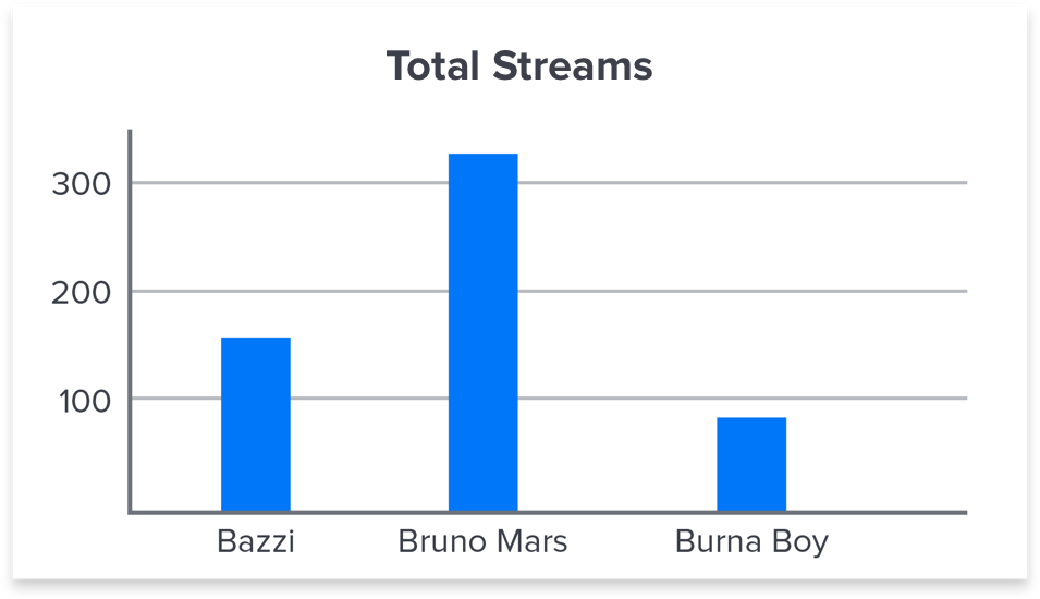
Column charts are used to compare two data values in a simple-to-read format. They offer a great visual to compare metrics in music data, but don’t drill deep into data set composition.

Stacked columns break down a total amount into the sub-amounts it consists of. Use them to compare a single metric with multiple dimensions, like total plays across streaming platforms, and be sure to keep colors consistent across data points.

Column plots are stacked columns that allow you to analyze the breakdown (sub-amount) of a data set instead of the total. They include multiple dimensions, but don’t display the total amount. Again, consistent color schemes are crucial for viewer understanding.

Bullet charts compare progress with a target value and indicate whether current progress is good or bad or satisfactory, all in a compact space. Background colors encode the qualitative range, but the symbol marker is equally useful to gauge performance quality. In this case, the goal of 1,200 monthly streams was not achieved.

Pie charts breakdown the individual parts in a data set, like listeners across streaming platforms. They provide an obvious part-to-whole relationship with a few key metrics, but become difficult to read differences beyond four inputs.

Heatmaps display multiple metrics and rank them against one another, using color to represent performance. The use of color makes it easy for the eye to scan heatmaps and quickly identify the best and worst of the crop. (Here dark is best and light is worst.)
Category 3: Change
Often times, we need to highlight the similarities or differences in values over a given time range. Here are three charts that display change accurately:

Line charts are the best way to vizualize trends over time. You can even use them to predict results for time periods in the near-future. For the sake of clarity, keep the number of lines under four and avoid using anything but solid lines.

Area charts are line charts with the addition of a volume value, represented by a unique color between each line and the x-axis. It’s a useful chart when you want to analyze both individual and overall trends over time, like return on ad spend by platform. They also provide strong visuals for part-to-whole relationships.
Category 4: Organize
When there is a hierarchy to the data or when there are broad sets of data you need to organize, these charts provide the best visual representation. Here’s an example:

Flow charts present a workflow or a process using a series of shapes with different meanings. The two most common shapes are rectangles (a step in the process) and diamonds (a decision). Flow charts offer a detailed visual representation of the sequence of actions needed to achieve something. They can also help to identify bottlenecks.
Category 5: Relationships
To draw relationships between metrics or to illustrate similarities in data, you have a number of chart options. Let’s take a look.

Scatter plots show the relationship between two sets of data, with one plotted on the x-axis and the other on the y-axis. By arranging data sets this way, a scatter plot reveals where things correlate and differ. In this chart, each dot represents an artist.

Combo charts display multiple related metrics over time and reveal relationships between them. The fictitious artist charted here continues to see an upward trend in Spotify popularity and followers, as well as Instagram followers. Beyond three or four variables, this chart gets confusing to read.

Funnel charts are an abstract version of a column chart, almost always used to represent stages in a sales or marketing process. It’s a simple, visually-appealing chart whenever you need to show user drop-off in a campaign or across a website.
All charts in this blog were designed by Wavo Product Designer Alexander Marttinen.